Updated Clinton vs. Trump Polling Map
By 270toWin Staff
May 16, 2016
We've updated our poll-based Clinton vs. Trump electoral map with an additional ratings tier (leaning) to better reflect differences in the polls across states as we move closer to the general election. Previously, states where the difference between Clinton and Trump was greater than 5 points were shown as a deep blue or red. This is now limited to those states where the difference is greater than 10 points. States between 5 and 10 points are shown as a lighter blue or red.
As you look at the maps, keep in mind that state-level polling to this point has been infrequent and may prove to be of limited predictive value. However, it gives us a place to start.
The first map is the polling map; limited to states that have been polled in 2016. Most of the dark blue states are the usual suspects. While Michigan and Wisconsin haven't voted Republican in a generation, the Trump campaign will likely try and put these and other rust belt states into play; those may poll closer as the campaign wears on.
Some of the traditionally Republican states where polling has been done are surprisingly close, with Arizona actually leaning Clinton in the limited polling. It is worth noting, however, that most of the deep red states have not yet been surveyed.
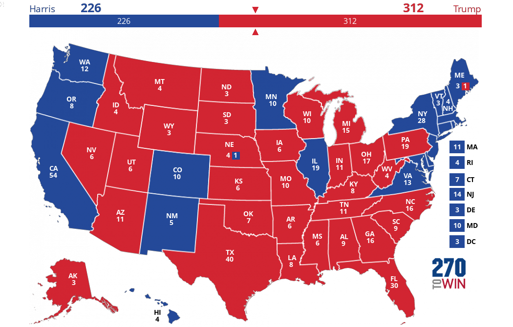
If we take the above map, and apply the 2012 winning party to the states that have not yet been polled, we get the following map. Click/tap it for an interactive version:
Your 2016 Forecast Map
You can create your own forecast starting from any interactive version, including the home page, the above map, our pundit maps or the library maps. For 2016, we've added the capability for electoral maps to have 3, 5 or 7 colors in the rotation. Just click/tap 'Map Options' near the share buttons below the map.


